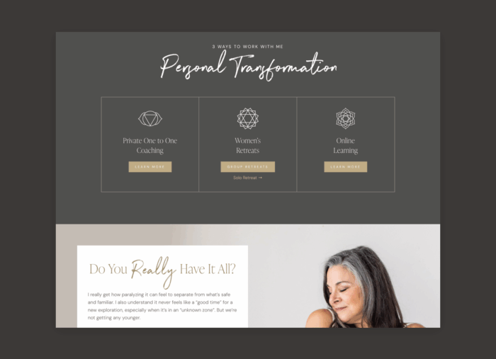
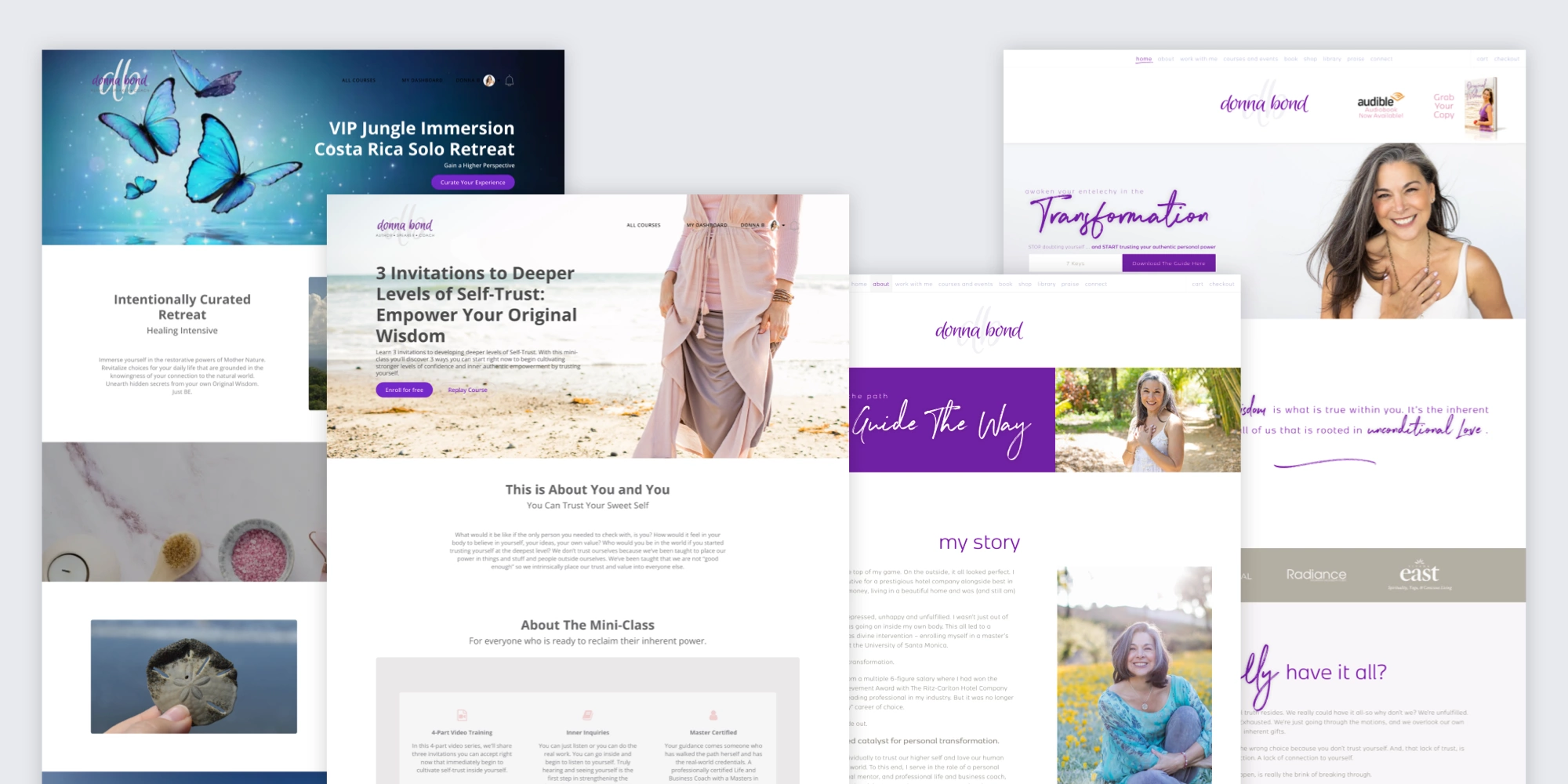
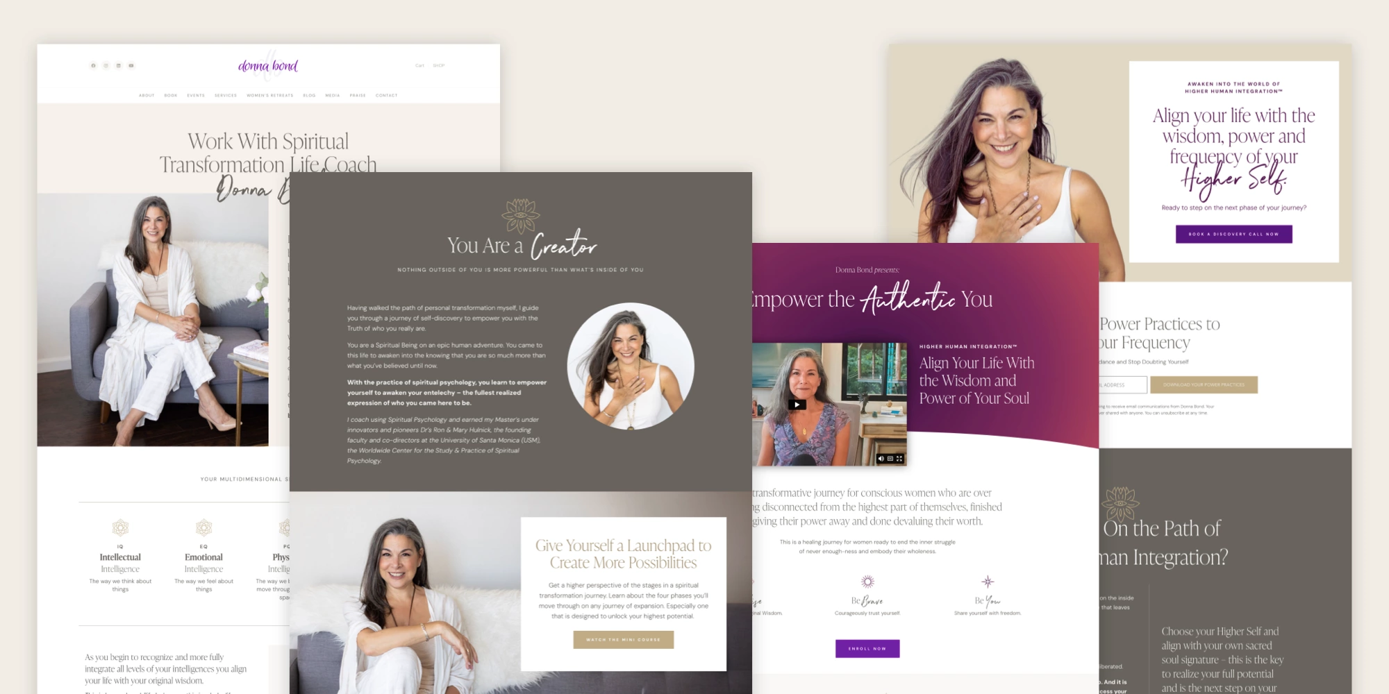
The Case Study Files

Donna Bond

Industry Spiritual Coaching & Personal Development

Project Type Style Refresh + Website Design

The Problem

Donna Bond had a powerful message, a growing business, and a deep connection with her audience—but her website didn’t reflect that anymore.

It felt outdated, cluttered, and visually inconsistent. The brand no longer matched Donna’s energy, professionalism, or the transformational nature of her work. She needed a refresh that felt elevated, modern, and aligned with the next chapter of her business.

The Solution

We led a complete style refresh across her site, redesigning the visual identity while keeping her existing brand essence intact. From layout to typography to color, every design decision was made to support clarity, elegance, and trust.

We delivered:

  • A brand-new homepage that makes an immediate emotional connection
  • Updated internal pages that guide visitors through Donna’s services and philosophy
  • Landing and sales pages for workshops, retreats, and coaching programs
  • An overall tone shift in design—from dated and busy to intentional and spacious

The Results

Before

A visually dated site that didn’t reflect the depth of Donna’s offerings.

After

A cohesive, modern website that supports her message, builds trust, and converts visitors into aligned clients.

This refresh brought a renewed sense of confidence—not just to Donna’s online presence, but to how she shows up in her business overall.

  • “Dear Javier and Mai, I am overjoyed with the stunning beauty that is my website. I am beyond elated with the impeccable design, the above and beyond customer service and the level of ease, accuracy and excellence you both operate with. I feel absolutely beyond grateful to be connected with you and you are now and officially my new designers. Thank you!!!!!!”

    Donna BondFounder — Consciousness Rising, Inc

Why It Worked

We didn’t reinvent the wheel—we realigned it. By refining the brand’s visual language and bringing consistency across the site, Donna’s message finally had the environment it deserved: clear, elegant, and transformative.

Interested in getting this kind of results for your brand?

See Other Case Studies

  • Ileana Schinder ARQ

    Ileana Schinder ARQ

    Logo RefreshPresentation Deck

  • Sweet Dreams

    Sweet Dreams

    Brand IdentityWeb Design

  • Inside Europe

    Inside Europe

    Brand IdentityPrint DesignWeb Design